Went in to Uni, Sheila is ill, no one told us, came back home. Fin
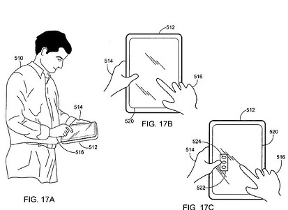
Bastards are at it again stealing my ideas. This time in patent form.
I'm really worried about the guy who drew these hands:
IM TIRED *yawn*
nottingham, carbon copy,
Flash = Crash
Fucking fuck stick, takes 4 hours to do fucking fuck intro for fuck site, you fuck.
Just separated my logo work from the week as it was getting too big. Need a way to sort that out now. Some tag system to link to other entries.
Just added a max size module to the diary that resizes images above a set size. Has made the whole thing take a lot longer though as it has to check the size of each image. At some point I'll add code to create a link to a full size counterpart.
I want to find a way to determine if an image has an alpha mask and choose either JPG or PNG export accordingly.
Just watched the movie Adaptation, well I watched the first half the second half was corrupt! no way I can get the film again! >
;-(
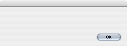
Just got a useful dialog from the Finder:
Just finished fixing and adding Rubicon to my Marathon collection, I guess I should add Evil and Tempus next.
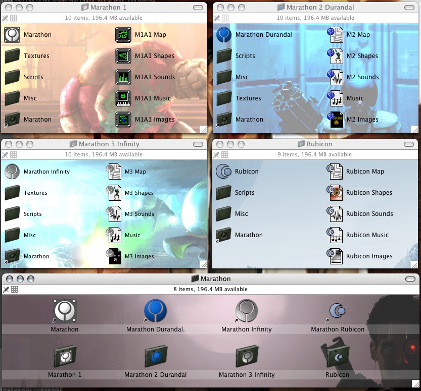
Slightly obsessive?... yes.
Couldn't help myself, I went and fixed in Marathon Evil and a few other misc pieces to create 'Marathon Pentalogy v4 osx.dmg'
Now if only I had time to play them!
08 Twelve After Midnight.mp3 as intro song to site, mite fit.
Agahhahahah I\'m going insane trying to find the smooth options in AE, if there even is one!
Scaled objects draw all pixely I want it to blend it/mip it.
I think I'm gonna extract my website work images from this diary, It's making it rather large!
23 mb so far for this week and 2 days to go. To be fair it compresses to about 3.4 mb as PNG, so maybe I'd better spend my time writing something to compress the RTFD's to PNG. These things are gonna take up a huge amount of space over time.
As always an inspiration
I want take some picts today, with the camera, add something from the real world to this thing. Makes me think I might want to add a function to resize images to a max value and supply a link to the full size counterpart.
Did work on Logo see separate file !LINK:Y2006-Mo1-W04-Logo!LINK
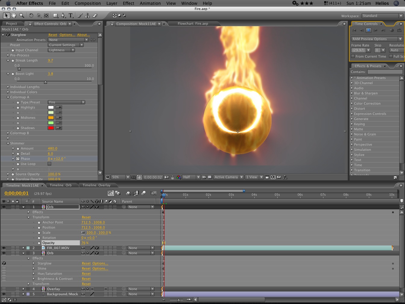
just finished a comp in After Effects:

That is the result in Flash, comes to 128k
I know I can use it as a screensaver on my site!
The new After Effects is ace, the new UI is a huge leap and makes it much nicer and quicker to use.
Got up at 8:30 woo, early for me, lets see how tired I am after 5 hours sleep.
Wasting tons of time converting Homeworld 2 music to AAC, dunno if It's even worth it!
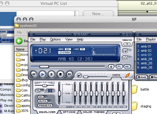
Having to use a PC, god they are fugly:
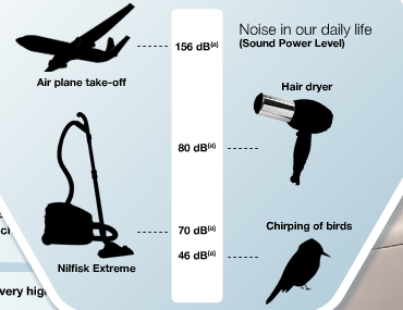
Talk about misleading scales:
Changed the color of my site.
Hmm, it would appear I am putting more in this Diary than I had expected. It's serving like a brain and image dump for me. I think I should look into breaking the months up into weeks. This file is 30 mb so far.
Just finished fixing the Diary script to work in week blocks, found some bugs. And fixed my opener script. It just keeps evolving! what next!
Hopefully one day I can get rid of the .rtfd hacky part. XML text format please!
I think I'll need to add a ignore element next, so that it only processes a week that hasn't been done, or hasn't finished yet.
It takes around 7 steps to prepare and then convert the files.
Just had my hair cut! It's a lot shorter but It's not short.
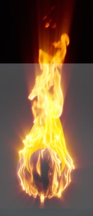
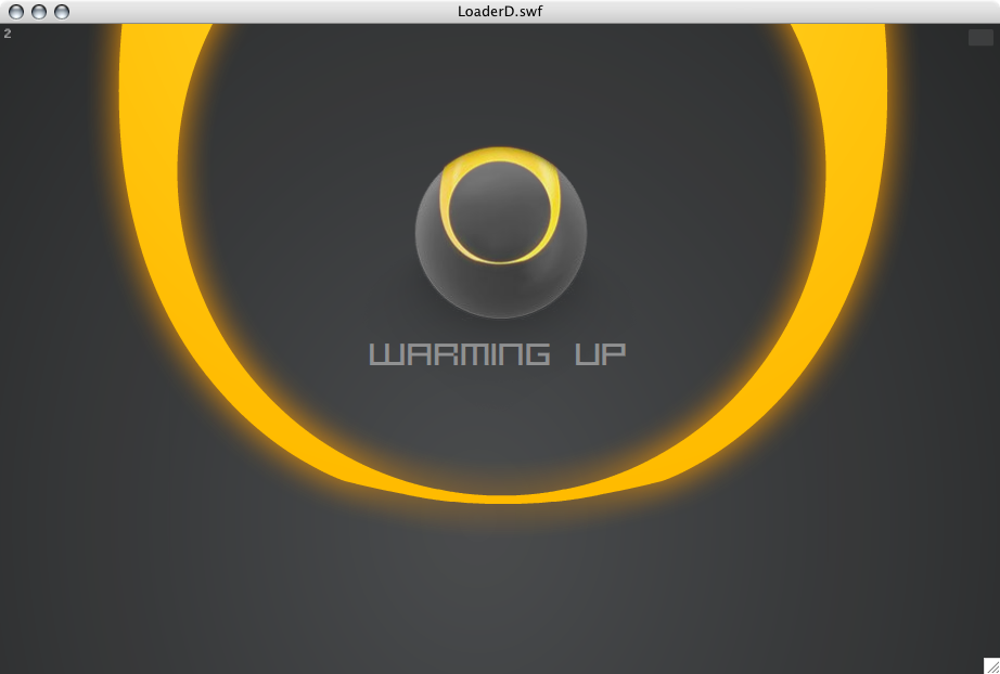
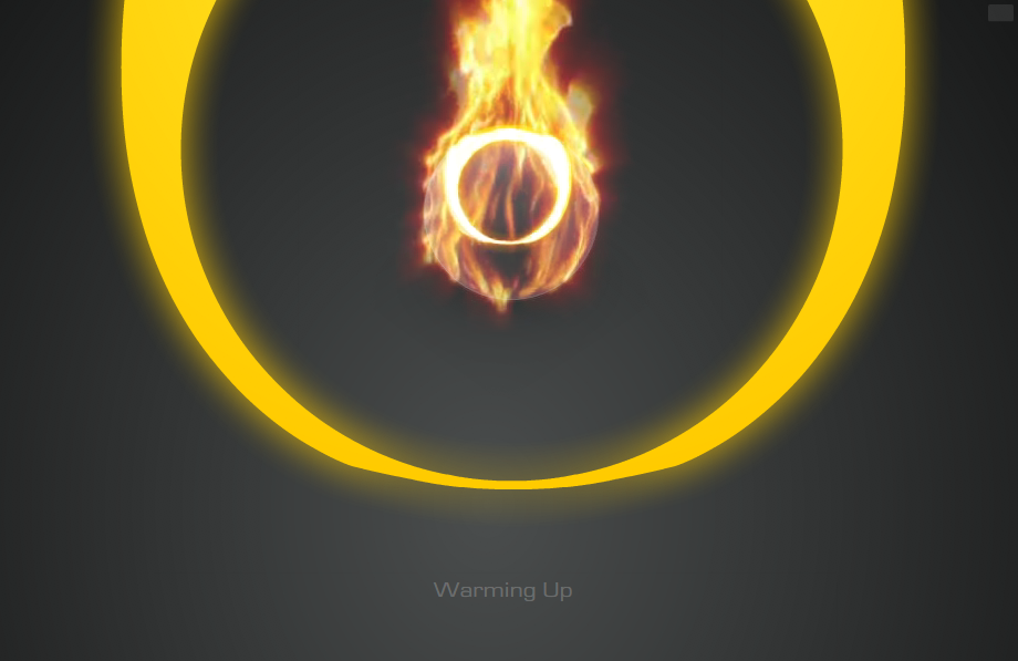
With the idea of fire now in mind, I started searching for stock video that could help me set this ball on fire. I found a perfect clip of an actual ball on fire. It fit perfectly and achieved the desired effect. It would still need tweaking to animate right and loop though. But it will need some tweaking to get it just right still
I just found stock video of a ball on fire! perfect!

Having to use Shake to crop movies! for gods sake!
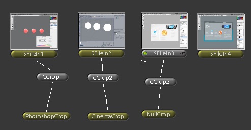
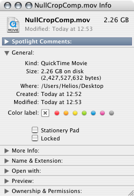
WTF, the file actually contains no data, so It's more like, 0


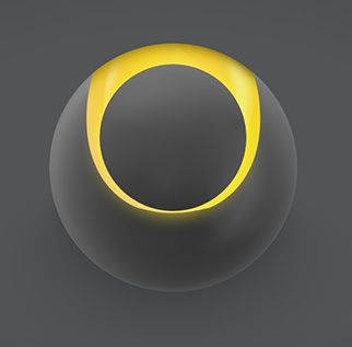
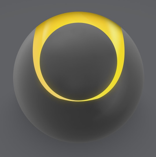
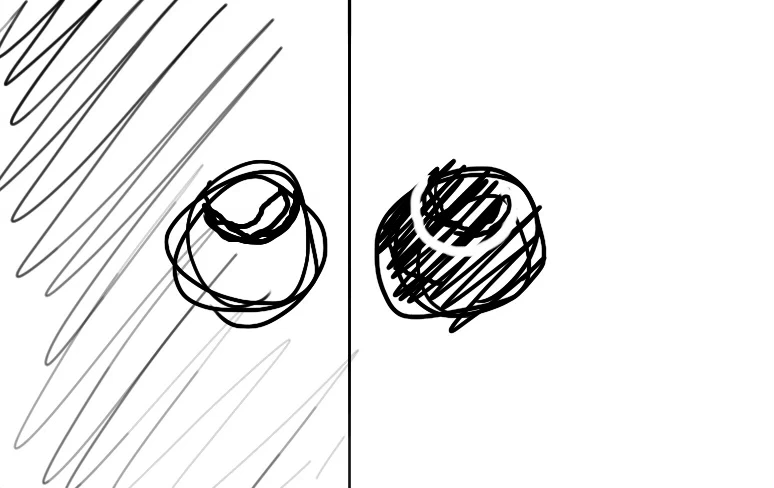
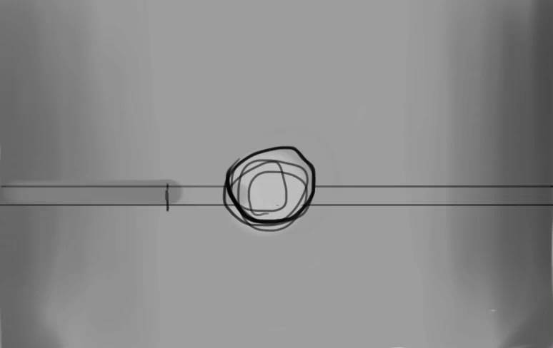
After removing the cube, I realized what I liked most about the fire illustration was the two resulting prongs within the sphere. With some adjustments, The result is a graphic that shows a circle within a circle.


just finished a comp in After Effects
I've had to bring in some other videos of fire, animate them sizing/moving in to make it look like the ball combusts
Also applying glows and shimmer etc

That is the result in Flash, comes to 128k
Now I can use it as a screensaver on my site!
:-)
I just found stock video of a ball on fire! perfect!
Having to use Shake to crop movies! for gods sake!
WTF, the file actually contains no data, so It's more like, 0
After removing the cube, I realized what I liked most about the fire illustration was the two resulting prongs within the sphere. With some adjustments, The result is a graphic that shows a circle within a circle.
just finished a comp in After Effects
I've had to bring in some other videos of fire, animate them sizing/moving in to make it look like the ball combusts
Also applying glows and shimmer etc
That is the result in Flash, comes to 128k
Now I can use it as a screensaver on my site!
The new After Effects is ace, the new UI is a huge leap and makes it much nicer and quicker to use.

I used After Effects to edit the flame movies together, adding filters to make it glow and sparkle more. Adding frames so that it looks like the fire starts from the ball and bursts out by overlaying another set of billowing fire and animating a clipping mask so that the fire appears to fire upwards from that. Then editing it so that It's loop-able. Also animated the ring of the ball to light up and shimmer.
This animation will show when it is loading the main chunk of graphics of the site, At the moment this happens very fast, so It's not on screen for long, but In future as graphics are added this will server as the main loading screen.
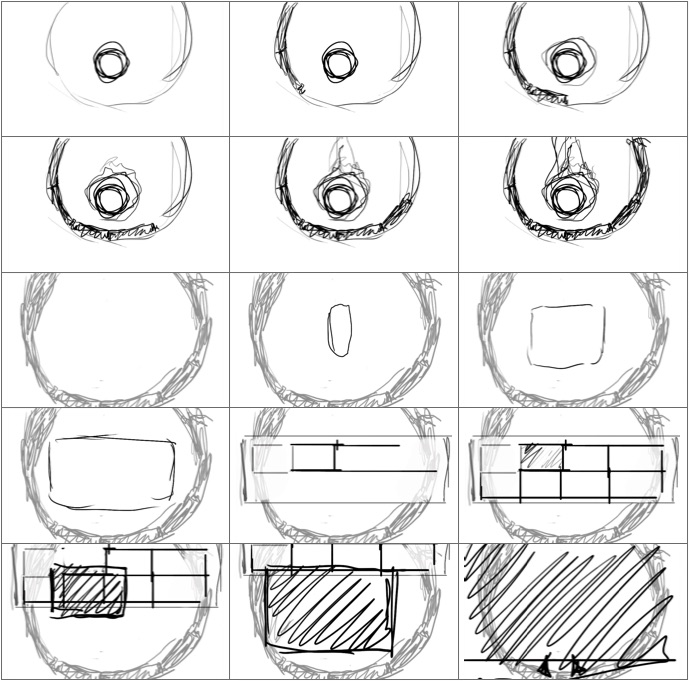
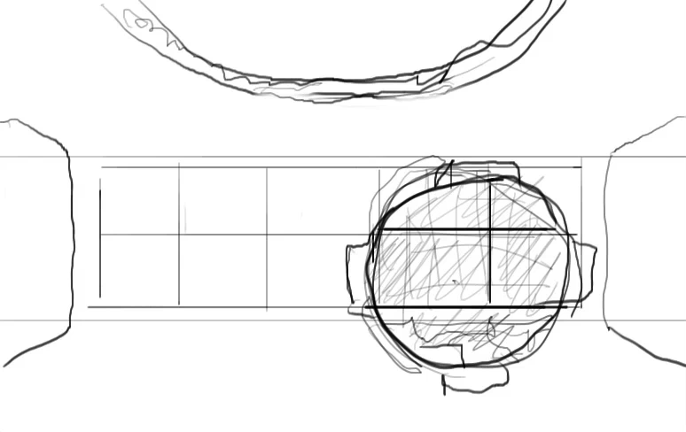
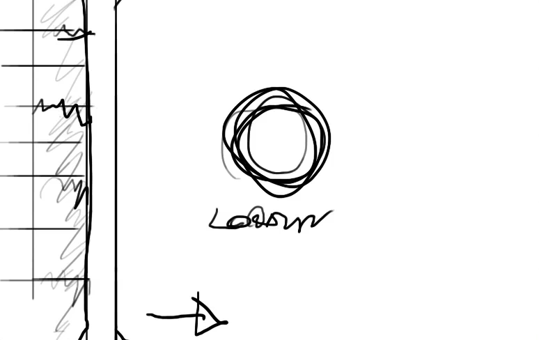
A storyboard of my ideas for an intro scene. A large ring starts drawing around a ball to represent loading progress. Once the ring is complete, it zooms inwards and the gallery scales in and draws the thumbnails.
At the end, when a user clicks on a thumbnail, it grows larger to fill the screen leaving a gap where it was in the gallery.
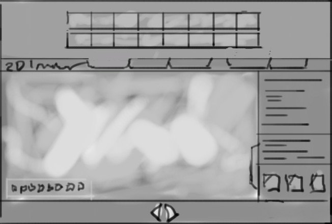
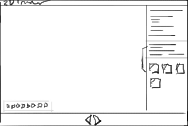
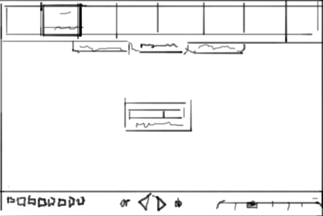
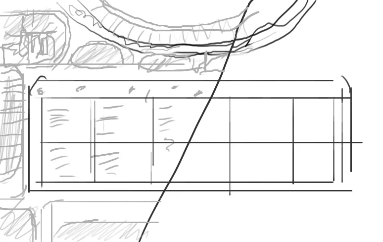
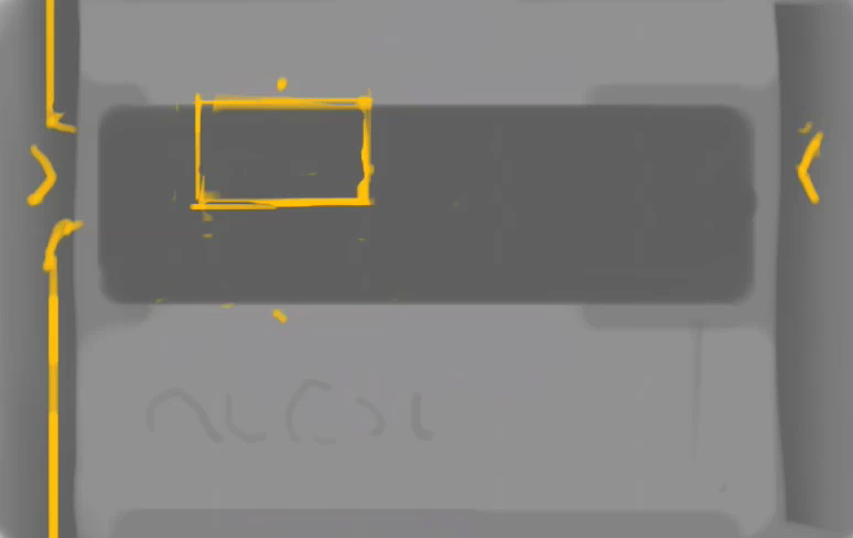
Sketching ideas for the layout of the gallery.
I like the idea of placing the thumbnails in a slide out segment at the top, that appears when the user moves within the top quadrant.
This would slide out atop of the section navigation and would make the site one place, removing the modality of switching from a thumbnail view to a full view.
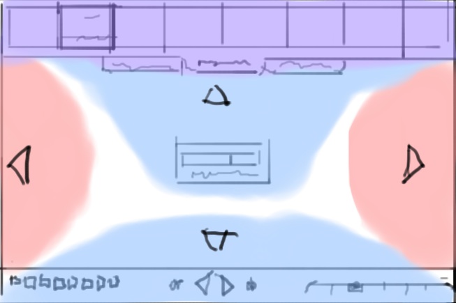
The colors represent my ideas of mouse within trigger spaces, when a user is within the red space arrows display and when clicked anywhere in the red space it performs the action of going next or previous. The blue areas when within slide out the corresponding element like a dock.

An xray type dissolve effect
Representing two sides to something in a special mirror.
An x-ray type magnifying glass
Ideas for an inner outer view, inside would should support structure for the graphical elements as
if it were a physical product
An animated beam, like a scanner, that comes across and reveals the inside view during the sweep
Just added a floating text widget:

This fades out as you slide to the left, but does not return, this way users are informed of the functionality n a fairly unobtrusive way, that is hidden in a simple manner. If I get round to adding a site memory function (so that it knows if a user has visited before, to remember visited images etc) I could have it display only till it is used and then never again.
The site graphics now in Flash complete with animation.
Working on Back, Next navigation in fullview. Added glows, and an eliptical backdrop to help visibility.

It's been a bigger pain than I had anticipated to get the graphics looking as I intended within Flash. Due to It's dynamic nature, the site may be drawn at any ratio or size, and designing for that is difficult. And coding for that, doubly so, my mind doesn't work very well with ratios and percentages and this work is absolutely loaded with them. After much struggle with relative positioning and scaling I have the graphics in line with my designed intention. And running at a pretty good speed after optimizations. Though the site still looks pretty stupid during intro on large display. Keeping a visual balance is so hard with dynamic layout
I've been tweaking the progress bars, the fullview progress bar now has a nice animation when fading in and out, taking advantage of Flashes new blur filter.
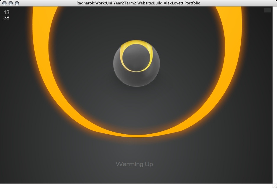
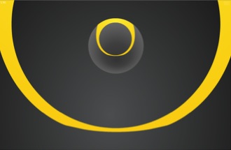
Status text shrunk and repositioned below ring.
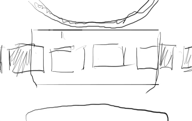
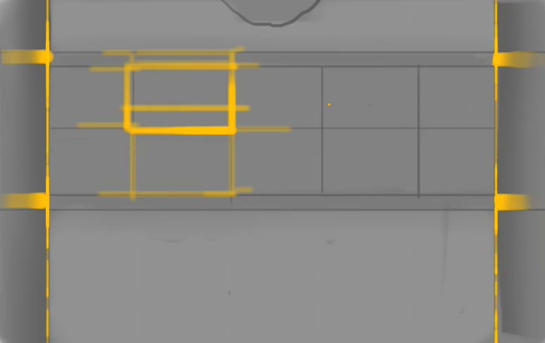
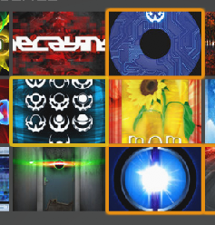
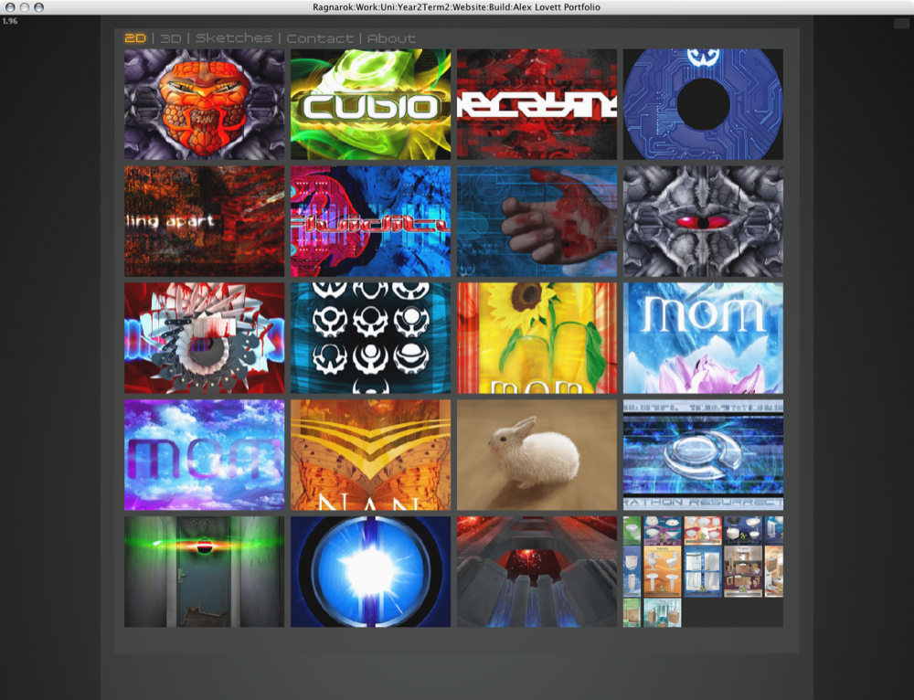
Below a shot of it loading thumbnails into the grid.
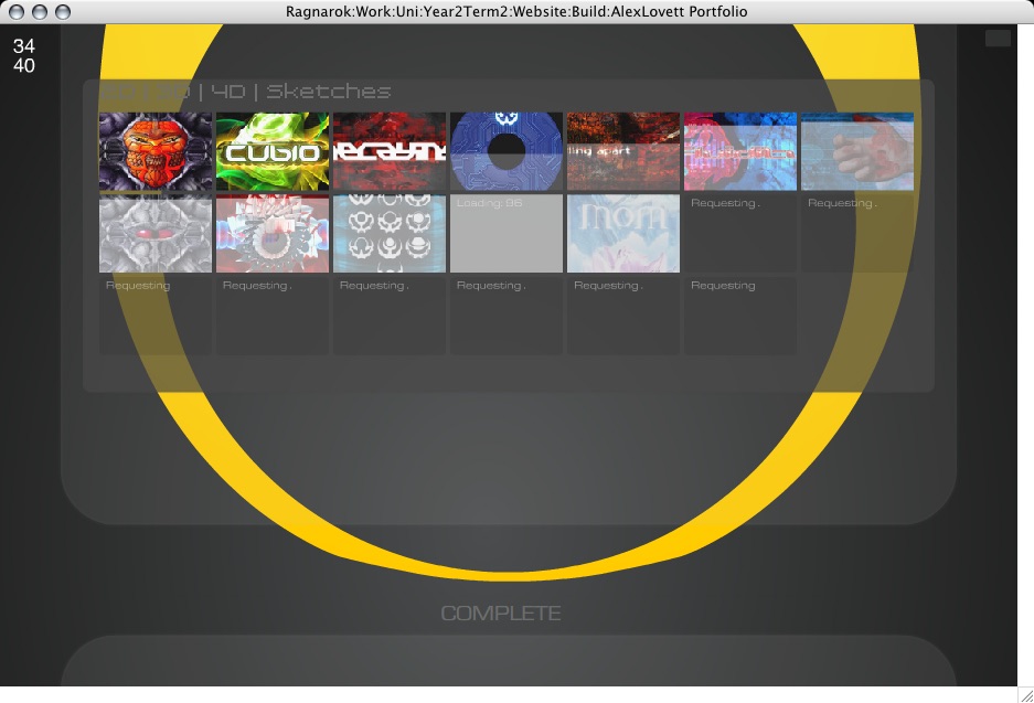
The thumbnail highlights/rollovers are not as spiffy as I'd like. I can't do them as I had designed due to... complexities involved with layering.
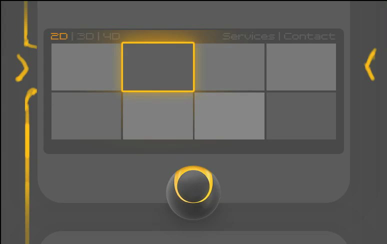
Darker orange denotes it has been loaded and viewed, yellow outline denotes it is under the mouse cursor and can be clicked.

Added section rollover highlights

Added an intro and exit animation on the close button tooltip. It's only subtle and short, but that's how I like it.
Fixed a faint button in the top right of the stage, that when clicked toggles stats on and off
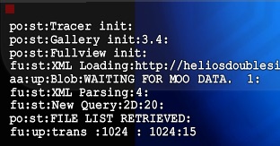
These help while debugging the site, especially when ran from a browser which has no trace window. It also turns on the FPS meter which Is important when optimizing the speed.
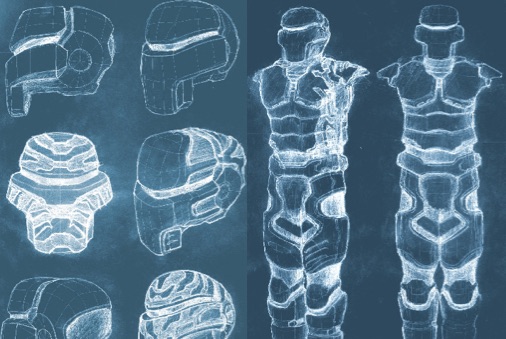
Would like to add inner views to all the sketches, I have the idea of simply fading between an inverted version of the same image, because that actually makes sketches look pretty weird and x-ray. But I want to do that in code, not with physically making inverted duplicates, would take forever. I've physically done it with a couple of sketches:
It's been a bigger pain than I had anticipated to get the graphics looking as I intended within Flash. Due to It's dynamic nature, the site may be drawn at any ratio or size, and designing for that is difficult. And coding for that, doubly so, my mind doesn't work very well with ratios and percentages and this work is absolutely loaded with them. After much struggle with relative positioning and scaling I have the graphics in line with my designed intention. And running at a pretty good speed after optimizations. Though the site still looks pretty stupid during intro on large display. Keeping a visual balance is so hard with dynamic layout
I've been tweaking the progress bars, the fullview progress bar now has a nice animation when fading in and out, taking advantage of Flashes new blur filter.
Status text shrunk and repositioned below ring.
Below a shot of it loading thumbnails into the grid.
The thumbnail highlights/rollovers are not as spiffy as I'd like. I can't do them as I had designed due to... complexities involved with layering.
Darker orange denotes it has been loaded and viewed, yellow outline denotes it is under the mouse cursor and can be clicked.
Added section rollover highlights
Added an intro and exit animation on the close button tooltip. It's only subtle and short, but that's how I like it.
Fixed a faint button in the top right of the stage, that when clicked toggles stats on and off
These help while debugging the site, especially when ran from a browser which has no trace window. It also turns on the FPS meter which Is important when optimizing the speed.
Would like to add inner views to all the sketches, I have the idea of simply fading between an inverted version of the same image, because that actually makes sketches look pretty weird and x-ray. But I want to do that in code, not with physically making inverted duplicates, would take forever. I've physically done it with a couple of sketches:
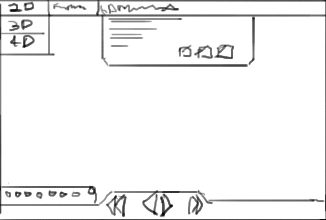
About Page
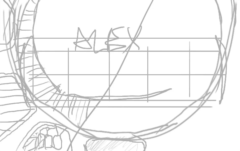
I have finally added my own name to my own site! ALEX:L Next I start work on adding an About page, this is to give a brief outline of what I do, what's special about this site, and that I'm available for hire.
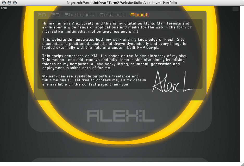
I had the idea to use my signature to personalize it more, I signed my name using my tablet and then traced over it with the pen tool in Photoshop, the tablet drawn signature is faintly underlaid.

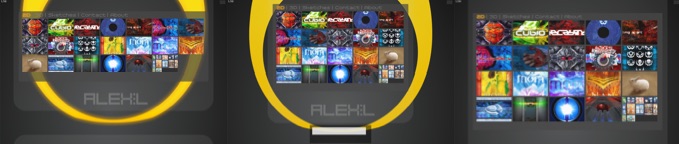
I've added an odd new behavior to the site, which is well.. It's cool and semi useful while also showing off that the site really is dynamic. I was hoping to create some nice graphics and animation for the 'inner view' of the website. But there's just not been time to clean up that concept or think about implementing it. So instead I have tied a few parameters to the duality slider such as width and height restrictions on the boxel and, well It's easier to just use it and see. When dragging left and right while looking at the site (not fullview) the site re arranges itself so that the thumbnails take up the full stage size and pushes my name off the bottom and hides the ring graphic. I think It's cool, What I want to do is have some kind of visual or interaction take place wherever you are when you use the duality slider, so the user knows it does something.
Below is it in 3 stages, normal, part way, and full.
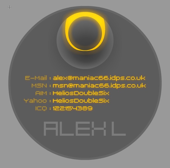
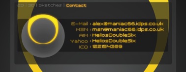
Contact Page
Working on adding a Contact page to the site:
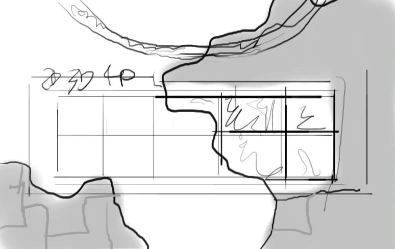
First idea to use concentric circles again. This design might make for an interesting business card that's round and not square, though It's difficult to get readable text into this size.
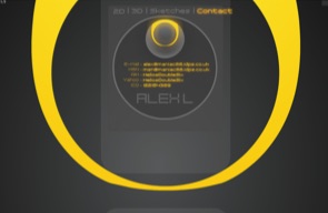
you can see that it is drawing it quite small, I'm limited in my vertical height,
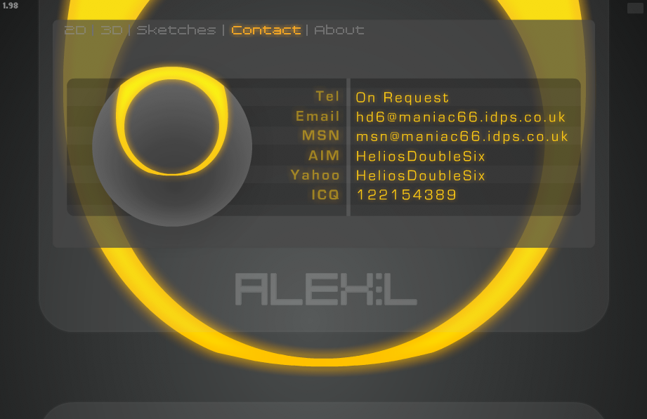
my layout prefers more landscape orientated pages and so I set about redesigning it.
The second version fits the layout much better:
And now the design further refined below, change of type face and other subtleties. Made the ring animate a little glow
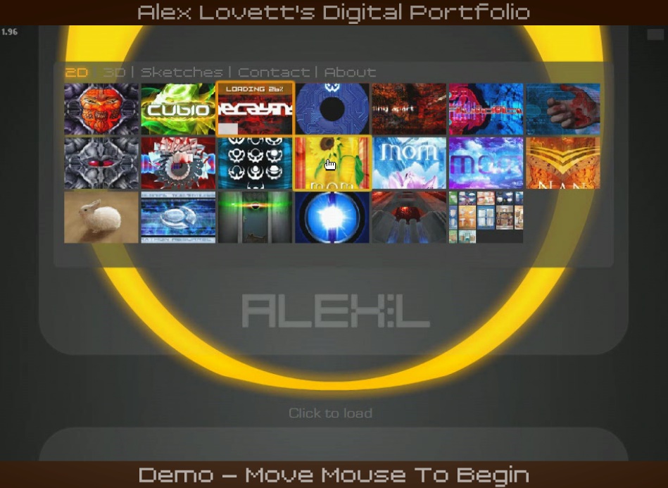
Screensaver
I have now implemented a screen saver function, as I am presenting this as a kiosk, I want it to be displaying things while people are not interacting with it. And so the portfolio detects when it has been inactive for a set period, and then displays a screen showing a video of the site being used with text explaining it is a demo:
As soon as the mouse is moved the site resets and starts loading from the beginning. You can press 'R' to reset to portfolio at any time. It was actually really hard to do that simple task. To reset the site to the very beginning, without actually re opening it. Because it loads so many variables and files which have to be cleaned out. In order to do this I had to create a new container that loads the site within it.
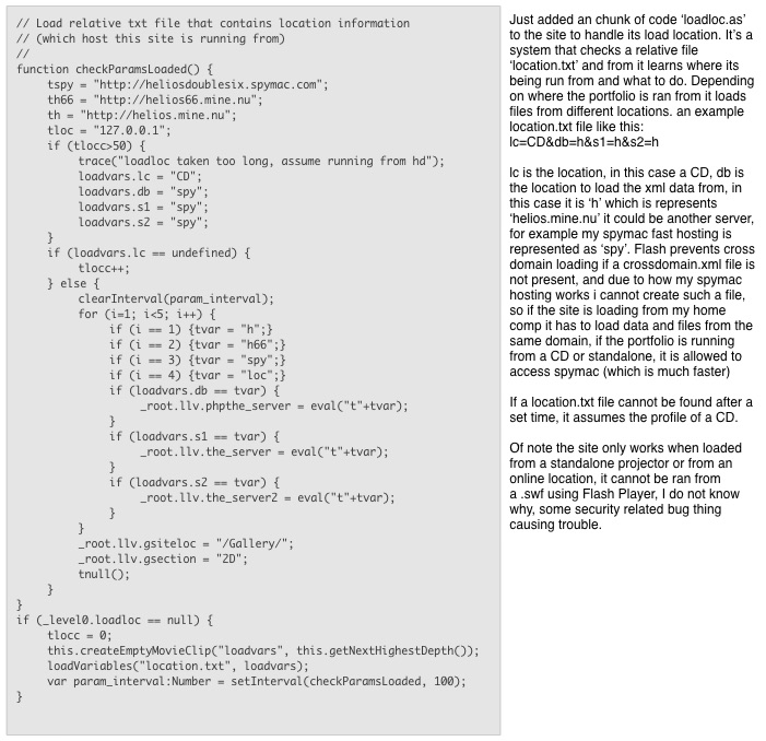
So now the site loads a Launcher.swf which is very small size, that file detects where the file is being played from in order to load data from the correct location (eg if It's loading from a CD or my website or some other exception) and then loads the loader.swf, the loader.swf loads the console, tracer, duality and fullview, and then the console loads the gallery, so lots of modules, but now they function pretty well independently.
In order to record a movie of myself using the site, I set the Flash FPS settings to 10fps and then recorded the screen at 10fps later speeding up the recording so it appears like normal speed, this was so that it ran super smooth and negated any impact on CPU the screen grabbing process was taking.
All sorts of problems have been encountered every step of the way with this project, simple things like loading an external .FLV and looping it, seem so simple on the surface, but require a lot of digging in manuals and fiddling to get round the many awkward security restriction flash now imposes. But I'm learning!
and I've added some code and animation to handle changing colour to show what current section the user is in. Orange is current section, Yellow is rollover. This helps the user understand where they are, and should make the navigation more apparent now it has a glowing orange bit lit up.
Final Shots
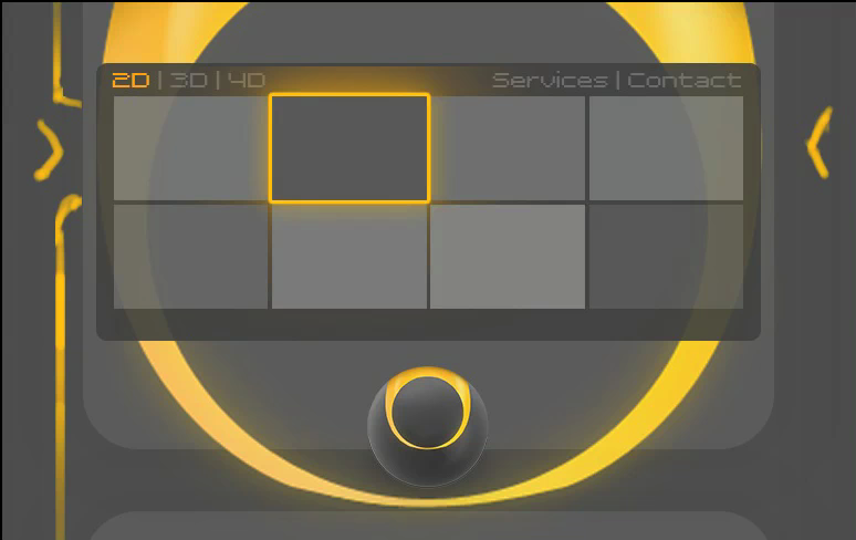
The ring fades thru Red, orange and yellow like It's heating up. And then he ball bursts into flames.
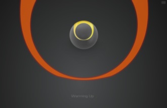
then he ball bursts into flames.
The Ring zooms into view, likes It's revealing an inner self.
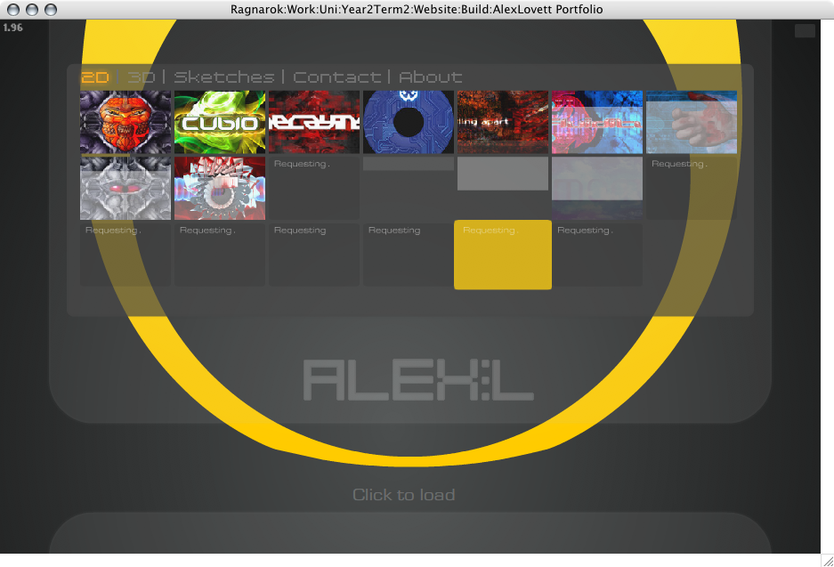
Thumbnails start loading. Grey faint squares represent the progress and look cool then the thumbnail fades in.
An enlarged view of how my site looks on a larger screen, higher quality thumbnails load in place.
I have finally added my own name to my own site! ALEX:L Next I start work on adding an About page, this is to give a brief outline of what I do, what's special about this site, and that I'm available for hire.
I had the idea to use my signature to personalize it more, I signed my name using my tablet and then traced over it with the pen tool in Photoshop, the tablet drawn signature is faintly underlaid.
I've added an odd new behavior to the site, which is well.. It's cool and semi useful while also showing off that the site really is dynamic. I was hoping to create some nice graphics and animation for the 'inner view' of the website. But there's just not been time to clean up that concept or think about implementing it. So instead I have tied a few parameters to the duality slider such as width and height restrictions on the boxel and, well It's easier to just use it and see. When dragging left and right while looking at the site (not fullview) the site re arranges itself so that the thumbnails take up the full stage size and pushes my name off the bottom and hides the ring graphic. I think It's cool, What I want to do is have some kind of visual or interaction take place wherever you are when you use the duality slider, so the user knows it does something.
Below is it in 3 stages, normal, part way, and full.
Contact Page
Working on adding a Contact page to the site:
First idea to use concentric circles again. This design might make for an interesting business card that's round and not square, though It's difficult to get readable text into this size.
you can see that it is drawing it quite small, I'm limited in my vertical height,
my layout prefers more landscape orientated pages and so I set about redesigning it.
The second version fits the layout much better:
And now the design further refined below, change of type face and other subtleties. Made the ring animate a little glow
Screensaver
I have now implemented a screen saver function, as I am presenting this as a kiosk, I want it to be displaying things while people are not interacting with it. And so the portfolio detects when it has been inactive for a set period, and then displays a screen showing a video of the site being used with text explaining it is a demo:
As soon as the mouse is moved the site resets and starts loading from the beginning. You can press 'R' to reset to portfolio at any time. It was actually really hard to do that simple task. To reset the site to the very beginning, without actually re opening it. Because it loads so many variables and files which have to be cleaned out. In order to do this I had to create a new container that loads the site within it.
So now the site loads a Launcher.swf which is very small size, that file detects where the file is being played from in order to load data from the correct location (eg if It's loading from a CD or my website or some other exception) and then loads the loader.swf, the loader.swf loads the console, tracer, duality and fullview, and then the console loads the gallery, so lots of modules, but now they function pretty well independently.
In order to record a movie of myself using the site, I set the Flash FPS settings to 10fps and then recorded the screen at 10fps later speeding up the recording so it appears like normal speed, this was so that it ran super smooth and negated any impact on CPU the screen grabbing process was taking.
All sorts of problems have been encountered every step of the way with this project, simple things like loading an external .FLV and looping it, seem so simple on the surface, but require a lot of digging in manuals and fiddling to get round the many awkward security restriction flash now imposes. But I'm learning!
and I've added some code and animation to handle changing colour to show what current section the user is in. Orange is current section, Yellow is rollover. This helps the user understand where they are, and should make the navigation more apparent now it has a glowing orange bit lit up.
Final Shots
The ring fades thru Red, orange and yellow like It's heating up. And then he ball bursts into flames.
then he ball bursts into flames.
The Ring zooms into view, likes It's revealing an inner self.
Thumbnails start loading. Grey faint squares represent the progress and look cool then the thumbnail fades in.
An enlarged view of how my site looks on a larger screen, higher quality thumbnails load in place.

The End
Well, my schedule plan as always went out the window after problem after problem arose. But I knew that would happen, the buffer zone was used entirely, but I have got it all done, near enough. Some things got laid to the side, such as the matrix-esque inner view ideas I had in mind. They might have been cool, but they all might have been incredibly CPU intensive, I'll never know.
The site works, it is for the most part very stable now, no obvious bugs or holes or trappings. Some timings can go out when resetting the portfolio but I'm hoping they are just rare and won't show up in real world use. I have my Mac mini setup running Windows and auto loading my portfolio and setup a internal web-server to server the data my site looks for, so it doesn't require an internet connection. Would have been nice to code in a offline loader, but this is just easier and really everyone has net, and I want the most up to date version of my stuff in circulation anyway.
I remember in the distance past to arrange and display nestled interactive work along with projects of increased depth in the form of the 4D section. The mind numbing complexity of showing multimedia work in a multimedia site still escapes me. One day ill attempt it, but not this day, I have made up for it by shoving my Sketches as a section unto itself. I can always use the duality view as a means to view projects with multiple elements, I have to a degree with the addition of some color spreads I did for a bathroom company aeons ago, and it works, but It's not quite right for that purpose yet, as It's hard to fixate on one variation without it sliding thru to the next a touch, some snapping needs to be implemented.
Some rough edges still, the status text needs to be better positioned around the ring, it can overlap it. And the alternate images (shown in the dual view) don't show load progress, they just load, and hopefully finish before you try and see them, fortunately this effect is not visible most of the time (if the net is fast) and thus the kiosk won't show this flaw at all.
Would I do anything different in hein-sight. Perhaps, maybe id make a trailer of my work instead!.. now that's got me thinking.
But in all honesty I like what I've achieved, I like it a lot, and it works, which is always good.
Now I need to add some good work to it, stuff without 'Mom' in it, and no more furry creatures.

